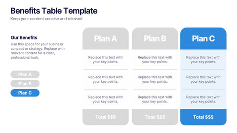
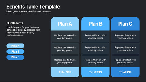
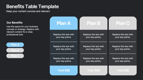
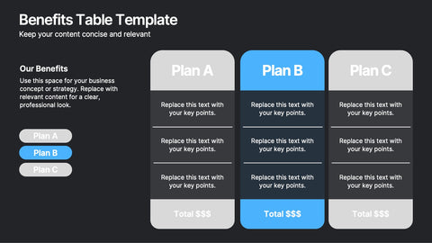
A KPI dashboard slide has one job: tell leadership how the business is performing without making them dig. This pack of twenty KPI dashboard infographic layouts gives analysts, ops leaders, and revenue teams polished visuals for executive scorecards, performance reviews, and the headline metrics that drive every monthly meeting.
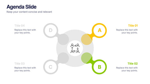
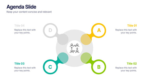
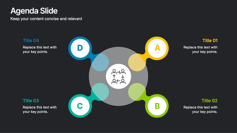
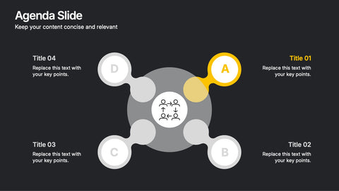
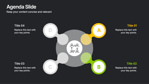
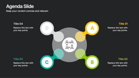
Use the multi-tile dashboard for grouped KPIs at a glance, the single-north-star dashboard for focus metrics, the trend dashboard with sparklines for direction over time, and the segmented dashboard when teams or regions need to be compared side by side. Each design balances visual clarity with the analytical depth a board update expects.
Open the file in PowerPoint, Keynote, or Google Slides and update metrics, targets, and brand colors in minutes. A solid fit for monthly business reviews, leadership offsites, revenue ops decks, product analytics readouts, and any moment when the audience needs the numbers told as a single picture.